Year
Multiple
Company
Multiple
Book covers: do it for the story.

Part of my path
Reading has been my hobby ever since I was little. It started in the library, where my mom took me every Wednesday. I’d finish the books within two days and the rest of the week I’d wait in anticipation for the next Wednesday. In school, I had read all the books assigned to my grade, and moved on to books assigned for the grade above. I also wrote my own stories and eventually, in high school, I started posting them online. I became a hit on Dutch Wattpad, with over 1.5 million readers. Because of that, my favorite Dutch teacher gave me the opportunity to do a week-long internship at the publisher Boekerij Meulenhoff, I remember having the best time. I wanted to combine my passion and my creative abilities, and started designing book covers. Maybe for once, you should judge my designs by their covers.
A certain hunger
During my holiday, I read this book. I was intrigued by the original cover, which featured a portrait that almost looked like a painting. Thinking about what I felt suited the story best, I was reminded of a painting of pomegranates by Henri Fantin-Latour, titled ‘Nature morte (primevères, poires et grenades)’. The painting is a still life but it was the pomegranate that stayed with me. The pomegranate symbolizes fertility and life but also power, blood, and death; all themes explored by Chelsea G. Summers in the story itself. The main character, Dorothy, is a female psychopath and a cannibal, one who craves power and, over the course of the story, fully embraces her true, cannibalistic nature.
A tale of two lovers & Purple Poison
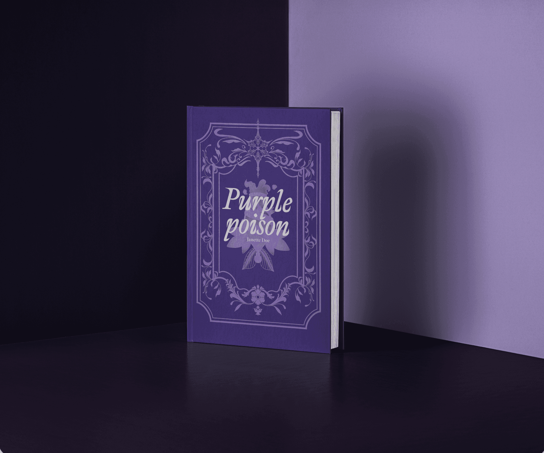
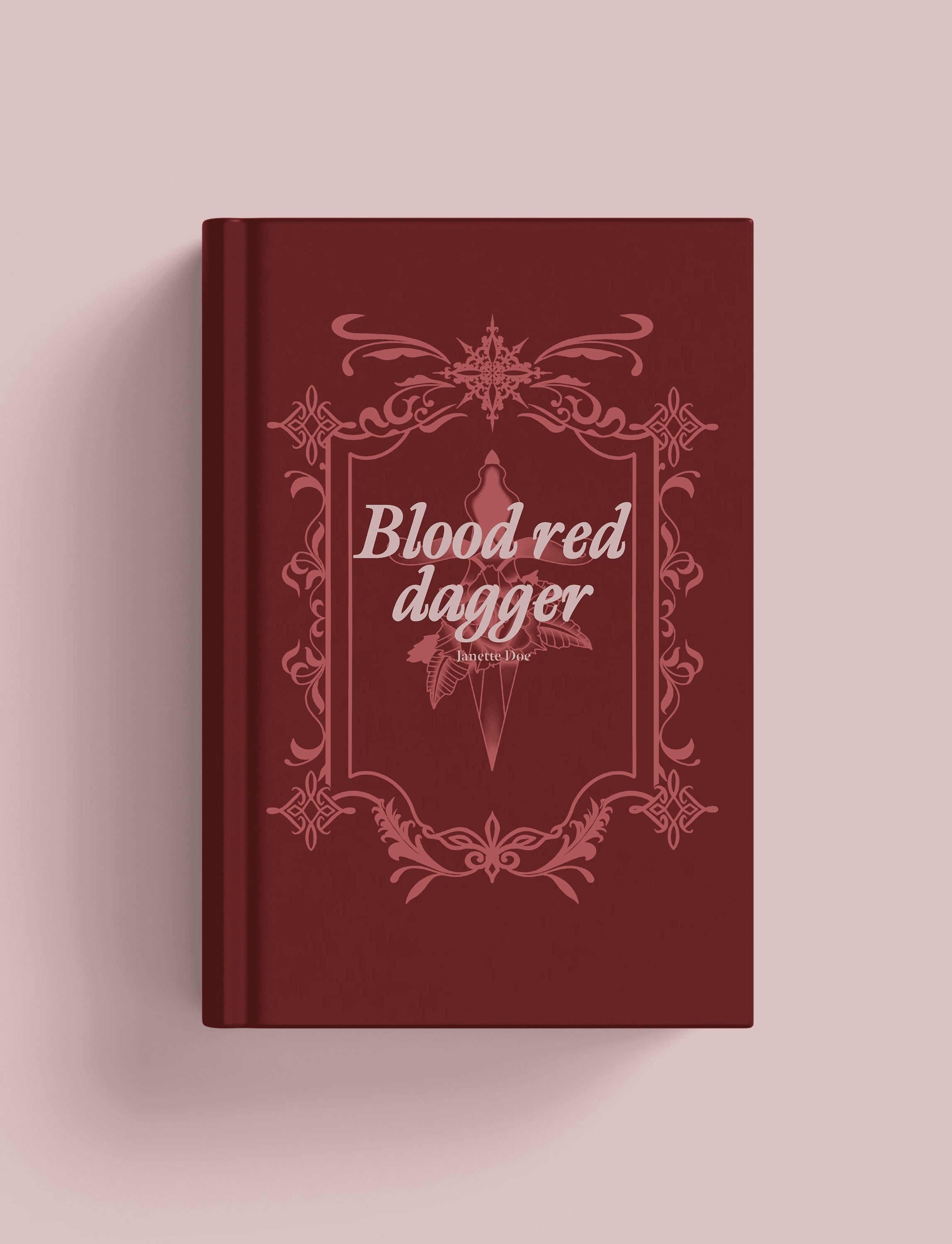
Both of these projects were inspired by the ‘romantasy’ scene that’s currently trending on social media platforms like TikTok. Both covers are fully illustrated and in each one I challenged myself to use a limited color palette to avoid making the designs feel too busy. ‘A tale of two lovers’ was inspired by mythology and tarot. The hands with wings were, of course, a nod to Achilles and the border design was influenced by the decorations on my very first tarot deck. With ‘Purple poison’ (and 'Blood red dagger' at the bottom of the page), I wanted to capture the feeling of a luxurious book while sticking to a single color range as a creative challenge.