Year
2025
Company
Specialisation assignment
Let's start a Ryot

Context
As a makeup artist, I've always seen makeup differently. For many brands, makeup is about enhancing features. In my experience, it's something much more personal; a creative medium that allows people to experiment, express themselves and challenge expectations. Ryot is a conceptual makeup brand designed for people who don't see makeup as a set of rules, but as a way to create something entirely their own. During my specialization, we were given the task to design a brand, and I saw my opportunity to design a makeup brand; something I always wanted to do. The beauty industry often encourages consumers to use products in one specific way. Lipstick belongs on lips, blush belongs on cheeks, et cetera. Artistic self-expression has never been about following instructions though, they're about creating your own. Although Ryot takes visual inspiration from brands like Dr. Martens and the attitude of old-school punk culture, the goal was never to recreate that aesthetic. Instead, I wanted to translate the same mindset into a makeup brand: independent, expressive and unapologetically different. That’s why one of the main strategies in the brand became to make the products versatile. I took that idea of not fitting into one box and used it in the visual storytelling as well. The project started with a simple question: How do I create a makeup brand that encourages people to experiment instead of telling them how makeup should be used? Rather than designing another beauty brand, I wanted to create an identity that challenged industry standards while remaining functional and versatile. The challenge became finding the balance between rebellion and usability, creating a brand that feels bold without becoming a flop.
Process of defining brand values
As a makeup artist, I noticed that creativity often happens outside the intended use of products. Lipstick can become blush, mascara can become eyeliner. Professionals have been working this way for years, yet most brands still package products around a single purpose. It isn't about teaching people new techniques, it's about giving them permission to experiment. This doesn’t mean the brand automatically gets catered to professionals, it’s also for the alternative dressers, drag queens, and consumers that want to get into make-up. It’s about providing a sense of freedom to do whatever you want. It should be easy to get into make-up. Think the Outlaw, if you had to pick an archetype. Before designing the visual identity, I first defined what Ryot should stand for. Three principles became the foundation of every design decision: • Self-expression: makeup should reflect personality, and offer the possibility to express however you’d prefer. • Versatility: products should encourage multiple ways of using them, why be forced to buy ten products when you want to play around? • Quality: coverage should be great, and in general a product should be able to last multiple purposes. Together, these values shaped not only the products, but also the personality of the brand.
A versatile visual identity
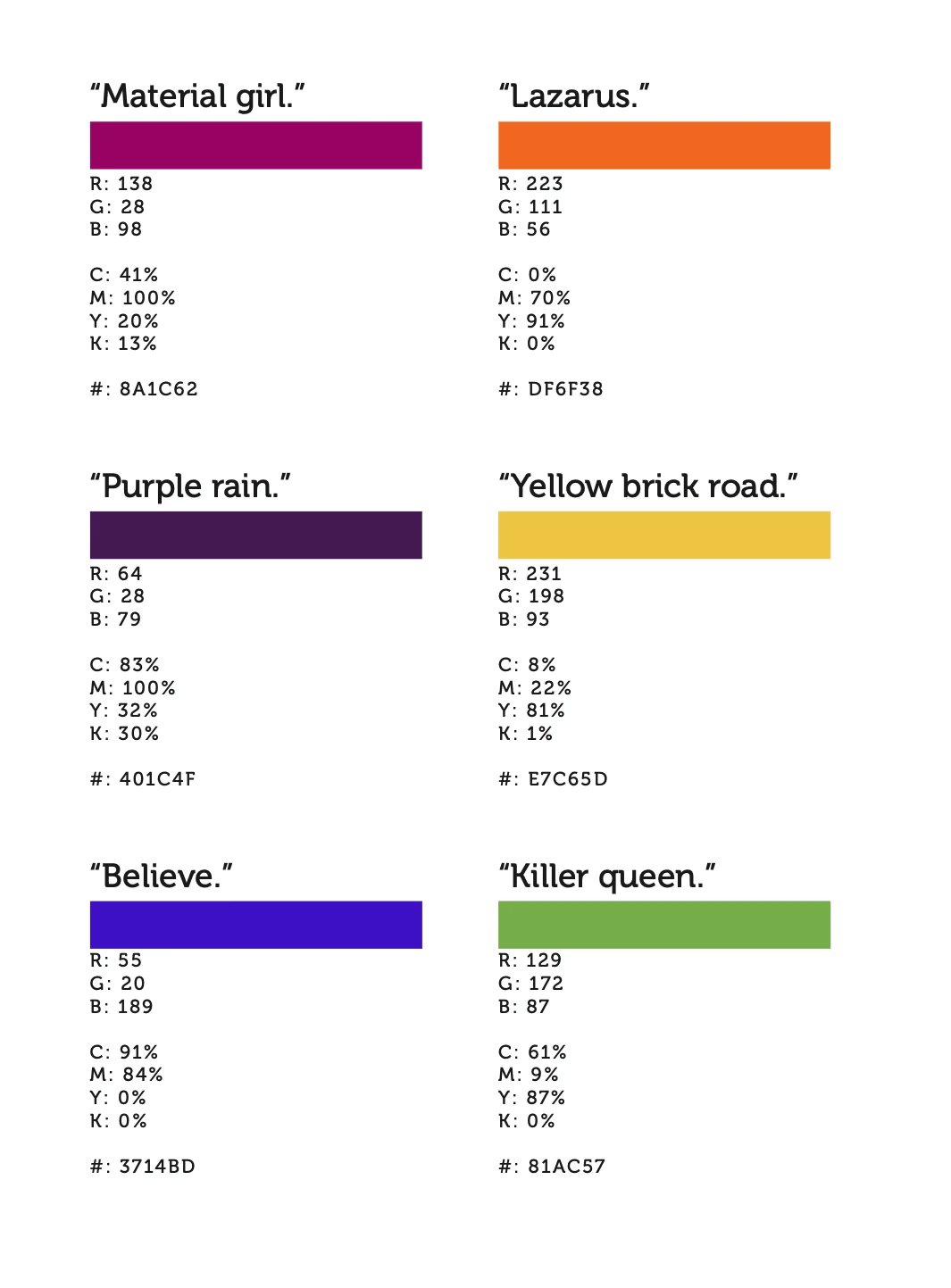
With the brand foundations established, I started experimenting with the visual language. I didn’t want to follow what other brands were doing, but at the same time I wanted it to be clear it was a make-up brand. It needed to be bold, experimental, a little bit of a push towards the regular. I deliberately explored the opposite of what everyone else is doing, of what is desired. I wanted to understand how far I could move away from conventional beauty aesthetics while still creating a recognisable makeup brand. That meant experimenting with symbols that don't belong in traditional beauty branding. I explored concepts using rats, skulls and other imagery inspired by alternative culture. Anything that is challenging. Colour became another way of rejecting the norm. Beauty brands often rely on soft pastels, neutrals and muted tones to communicate elegance and femininity. I intentionally moved away from that visual language, experimenting instead with saturated, contrasting colours that feel energetic, expressive and impossible to ignore. The goal wasn't simply to be different. Every visual decision needed to reinforce the same idea: makeup shouldn't be limited by the rules of the industry. With that, I decided to play around with the letters as well. The phrase, “Better skillfully appropriated than badly conceived”, played in my head. As the concepts evolved, one symbol stood out. The skull became the centrepiece of the identity. Inspired by the male-dominated punk scene, it represents rebellion while reclaiming that visual language for a brand centred around creativity and self-expression. And I took it further: I made the logo feminine. To circle back to: “Better skillfully appropriated than badly conceived”; the accompanying wordmark was developed by a study of existing beauty brands and reconstructing their letterforms into a collage-like logo. The result feels familiar enough to belong within the beauty industry, yet different enough to question it. Rather than creating something polished and predictable, I wanted the identity to feel like a visual statement. A subtle "fuck you" to conventional beauty branding without sacrificing quality or usability. The visual identity was designed to be as versatile as the products themselves. Hand-drawn illustrations can be layered over photography to create energetic, collage-inspired compositions. Photography focuses on diverse people with distinctive looks, always placing makeup at the centre of the image rather than the model itself. The bold colour palette reinforces Ryot's rebellious personality, while a structured typography system balances expression with readability. This flexibility allows the identity to adapt across packaging, campaigns and social media while remaining instantly recognisable.